Brand
Guidelines
Overview
We believe barbershops are the cultural heartbeat of every community—spaces where style, conversation, and transformation intersect. theCut exists to amplify that culture by giving barbers, shop owners, and clients the tools to book, pay, and manage their businesses—all in one seamless platform.
We’ve built the world's largest barbershop platform with over 7 million users and 17,000+ active barbers. Our mission is rooted in solving real pain points through simple, mobile-first tools—no extra apps, no high fees, no BS. This brand guide ensures consistency across all visuals and messaging, aligning every touchpoint with our identity: built for the culture, designed for growth.
Mission statement
To empower barbers, shop owners and clients to be the best version of themselves.
Vision statement
Barbershops are epicenters of culture. We're building the world’s largest barbershop platform—living at the intersection of all things culture, style, and technology.
Wordmark Logo
This section covers the details of our wordmark. You can find a downloadable version under Resources.

What's in a name?
Everything, to sum it up. Your name is how you identify yourself. What you build your identity around. When someone who knows you hears your name, they often immediately visualize their experiences with you and think about how they will engage with you next.The same holds true for a brand.
Our name is theCut. It’s pronounced, “The Cut.” Our name is written as one word, but pronounced as two.
theCut:
- The first three letters in our name are lowercase.
- The fourth letter is uppercase.
- The last two are lower case.
Our cursive logo is available via Resources. But when writing about us, our name should be written as described above.
The one exception to this rule when our name is used in a title or in a paragraph header where the text is in all caps. In this instance our name should be “THECUT”.
Color
Our logo is displayed in two colors: black and white.
Logo should never be gold.


Exclusion zone
To ensure the logo is clearly visible, surround it with space free of elements that might cause confusion. The logo’s exclusion zone is equal to the height of the logo.

Partnerships
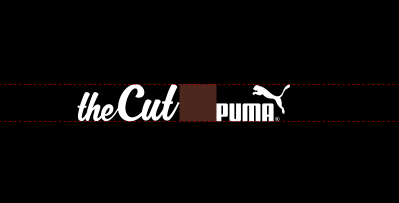
Follow the exclusion zone guidelines when locking theCut logo with affiliated logos. That means you should separate partner logos by a distance greater than or equal to the height of theCut logo.




Brand color palettes
We’ve organized our main color palette into three categories primary, nuetrals, and gradients. This could expand over time.
Our primary colors are black and white — bold, clean, and timeless. They reflect our focus on simplicity, clarity, and confidence. Black serves as the foundation of our visual identity, setting the tone and attitude of the brand. White provides contrast and space, giving our layouts room to breathe and keeping the experience focused. Together, they create a strong, minimal framework that allows our photography, typography, and community to stand out without distraction.
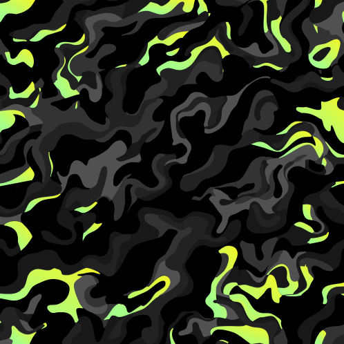
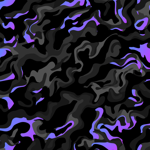
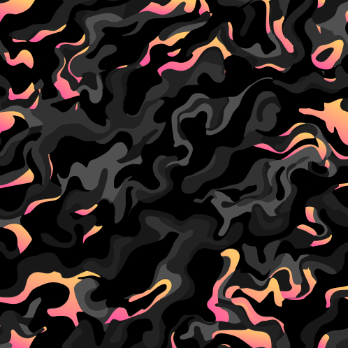
Each user type in theCut ecosystem — Barbers, Clients, and Shop Owners — is represented by a distinct gradient. These gradients visually reinforce identity and create an instant connection between our users and the brand.
We use these gradients across marketing and product design as subtle accents — often behind pill-shaped labels, layered into our hair camo pattern, or as highlight moments within motion graphics. Their role is to bring personality and recognition to each user group without overwhelming the core black-and-white aesthetic.
Our gold tint represents what we want for every barber: success, achievement, and triumph.
It is used exclusively as our primary tint color within the app — drawing attention to key actions and moments without overwhelming the interface. Gold is meant to highlight, not dominate.n behind pill-shaped labels, layered into our hair camo pattern, or as highlight moments within motion graphics. Their role is to bring personality and recognition to each user group without overwhelming the core black-and-white aesthetic.
We no longer use gold in marketing materials. This shift allows our brand to stay clean, versatile, and focused on showcasing the real people and work that define theCut.
Our fonts
A bold and clean combo to speak our truth.
Akira Expanded
Use all caps and bold weight for headers
REGULAR
ABCDEFGHIJ
KLMNOPQRST
UVWXYZ
bold
ABCDEFGHIJ
KLMNOPQRST
UVWXYZ
OUTLINE
ABCDEFGHIJ
KLMNOPQRST
UVWXYZ
MONTSERRAT
Use sentence case and regular/light weight for body copy and subheaders
Regular
AaBbCcDdEeFfGgHhIiJjKkLlMmNnOoPpQqRrSsTtUuVvWwXxYyZz
Light
AaBbCcDdEeFfGgHhIiJjKkLlMmNnOoPpQqRrSsTtUuVvWwXxYyZz
Patterns
This section covers the details of our pattern. You can find a downloadable version under Resources.
Hair camo
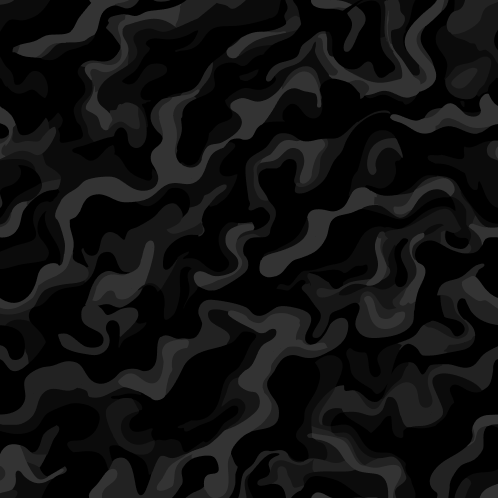
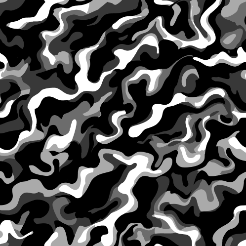
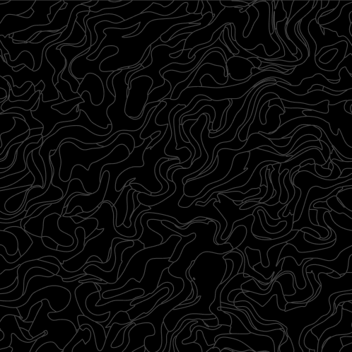
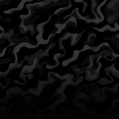
Our custom camo pattern was created to deepen our brand identity and establish a recognizable visual fingerprint across all brand touchpoints. Inspired by hair — its flow, movement, and natural variation — this pattern reflects the culture, craft, and energy of barbers.
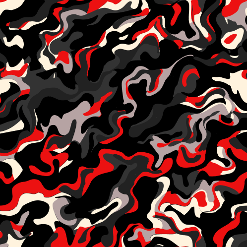
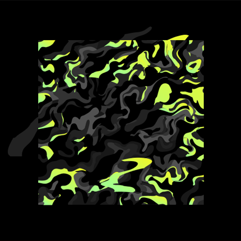
Variations
Feel free to magnify the hair camo to create a more abstract background. You can also show the edge of the hair camo if you don’t want the pattern to fill the entire area
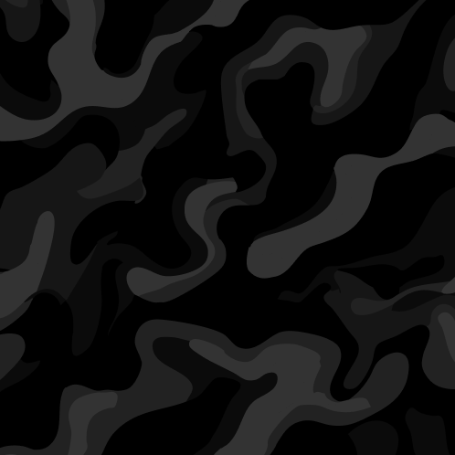
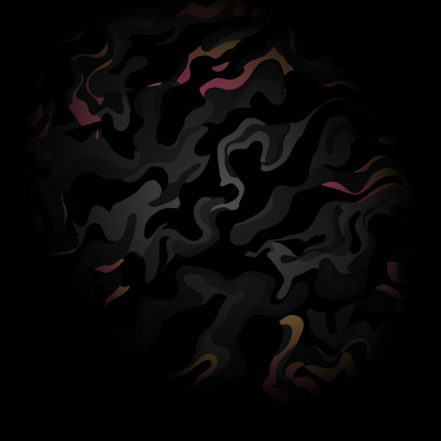
Examples
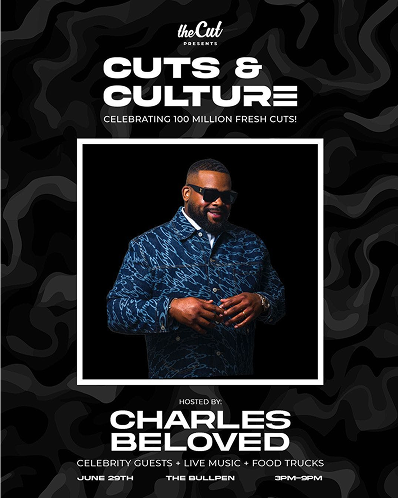
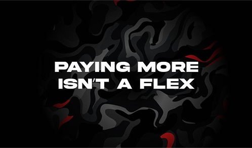
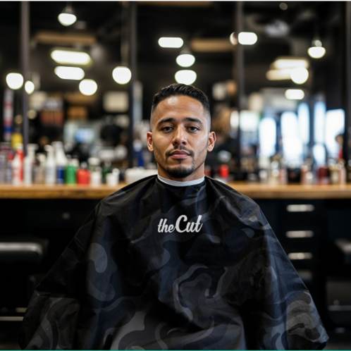
Feel free to use dark or light camo for backgrounds. You can also combine both light and dark camo pattern for a cool contrast effect.
Photography
Composition and context
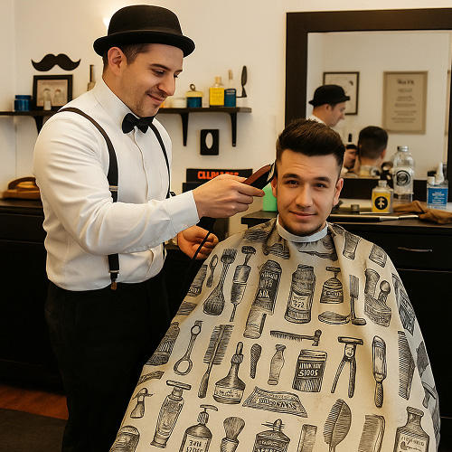
The people and objects we include in our photos provide our audience with all the context it needs to understand our brand. For us, that's the urban barbershop community: fresh fades, tattoos, streetwear, dope sneakers, hip hop, and street art.


Environment
It’s important to establish consistency with location and lighting. Preferred locations are inside a barbershop or in a urban environment and lighting should be leveraged to create drama.


franchise or stock photography vibe.

Color palette
The people and objects we include in our photos provide our audience with all the context it needs to understand our brand. For us, that's the urban barbershop community: fresh fades, tattoos, streetwear, dope sneakers, hip hop, and street art.


